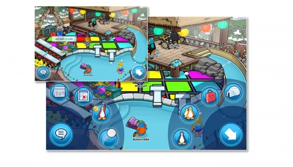
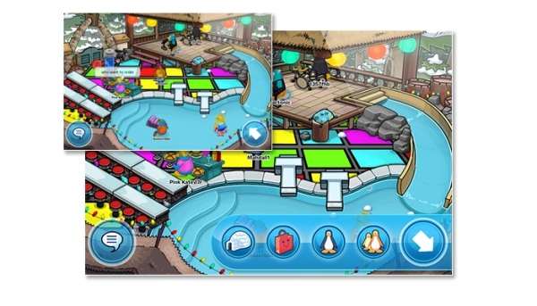
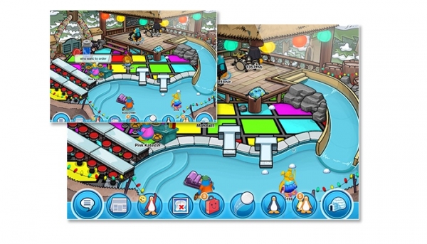
The My Penguin team is working on porting the iPad application to the iPhone and iPod Touch and they need your help on choosing which user interface to use in the app out of three possible choices! The three possible concepts are as follows:
Concept one:
Concept two:
Concept three:
I prefer the second concept because it has the least amount of clutter, although I’m curious where the buttons shown in the other ones (such as the newspaper) will be located since they aren’t shown. Which do you like the most, readers of Club Penguin Memories? Feel free to vote in the poll below and let the team know on the blog!. My Penguin will also come to Android later in time.
–
The following page has been updated:


Concept 2
I like concept 3 the best.
#3! :D
Concept #3
Third sucks because you don’t have a lot of walking space.
Concept #3
TYPO ALERT!!! TYPO ALERT!!!
“to the iPhone and iPad Touch and they…”
“to the iPhone and iPod Touch and they…”
Thanks. I fixed it.
Concept #2
What is that penguin saying?
“who want to order”
-_- who want to order?
That’s what the penguin is saying, they probably meant “wants” since they’re at the diner furniture peace.
Train i saw a really funny picture herbert needs to have
http://memecrunch.com/meme/S0N1/gary-the-gadget-guy-was-frozen-in-november
take that herbert :P
http://gadse244.wordpress.com/author/gadse244/page/9/
Translate it and you will get the joke XD
I like concept 2, but I just hope they hurry up on the Android version me and the other Android users are starting to get cranky! :P