Surprise! It’s finally here! After being delayed for a while, Club Penguin’s new blog design is now here.
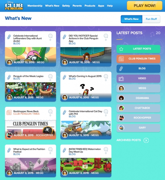
Here is the main blog page:
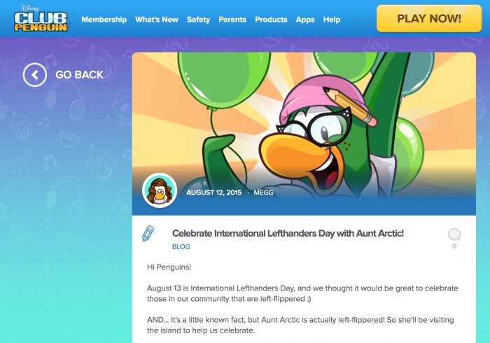
And here is what an individual blog post looks like;
How do you like the new design? I think it’s a nice overhaul, although I feel like they’re wasting space on the left side under “go back”.
Looks good
I want the old back…
That looks so cool, with all the colours
http://www.factorycreate.com/ Have a “Disney’s Club Penguin Special 30 min” In production and it’s already airing in the UK on Disney Junior and Disney XD.
I would like id they showed that this year because I didn’t see it last year (I couldn’t find the remote to turn up the volume so it was on mute the whole time)
*if
I won’t bother to read as much of it,
I don’t like having to click to get the first story, then click back, then click to get the second story, then click back, then click to read the third story, then click back, then click to read the fourth story, then click back, then click to read the fifth story, then click back, then click to read the sixth story, then click back, click to read the seventh story, then click back, click to read the last story, then click back…
nah
Might click two or three if they look really interesting.
Yeah, that’s a good point.
But thats how cp memories and cp space work too…
True. :P But the CP blog has always been the other way.
…But I find most of Trainman’s posts are good, so I read almost every one.
The clicking is worth it here.
;D
Good response. :P
Yay! We finally have a blog redesign which was supposed to be released in June. But then it was moved to July. And now we got it in the middle of August!
I like the new design :)
seems like it’s geared towards touch screens
and that unnecessary space under the “Go Back” button bothers me to no end. The content needs to be centred smh
It’s great I guess. But now you have to click each one-by-one to see the post. The old version had the post and you only had to click to go to the comments section. And yes, it looks a bit uneven with the Go back button. They could have made the blog completely take up the page with a small Go Back button at the top.
I hate it, because you can’t just read all the posts on the front page at once. You have to click on them individually to see them all, one by one. The new design also seems focused on phones and tablets, but I think that Club Penguin Team or whatever they’re called should also focus on PCs as well. I know of one website which eventually became impossible to use on PC because the people who made it focused way too much on making it easily accessible to touch-screen devices. I don’t want Club Penguin to go the way that website did.
Also, I agree that the “Go Back” button is uneven and the left side of the screen is too empty. The “Go Back” button should’ve been in the corner of the screen or something, and the actual blog post could take up the whole screen. Heck, at least fill the space up with something else. Like, say, links to other blog posts that might be related to the one you’re looking at.