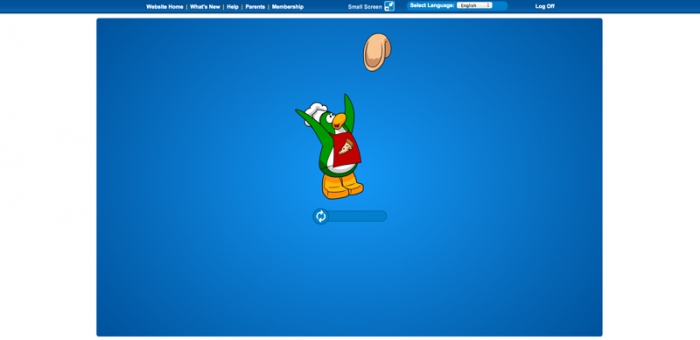
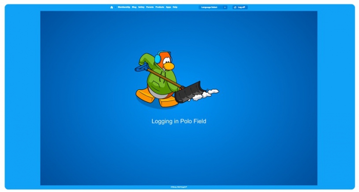
Tomorrow when Club Penguin updates they will also be giving the play page a brand new look. Along with the new look and a few minor changes it looks like they are also removing the small screen feature, as I see nothing to toggle that in the sneak peek Polo Field posted on the blog. The biggest change is the page will go from having a white background to a light blue background. They’ll also be updating the look of the navigation bar and order of links. Currently it’s Website Home / What’s New / Help / Parents / Membership but in the update it’ll be Website Home / Membership / Blog / Safety / Parents / Products / Apps / Help. Here’s what it’s going to look like:
Here’s what it looks like now.

How do you feel about this update?

When will you make Reminder Club Penguin Updates Tonight! post?
At midnight PST, so in just under 7 hours.
Blue. Blue everywhere.
This update is O.K. I really will miss the old look. I kinda think there is too much blue.
Some of this I won’t get to see because on Mac, it changes some of the controls like language select. Otherwise it should be the same.
I prefer the current update :/ It’s TOO blue and adjusting the screens was ACTUALLY useful. If you found yourself in a crowded server and room, small screen would come in handy.
Not the first time CP does pointless updates which in fact, the previous one was better and more useful (inventory order for instance). Although I feel CP should’ve updated several aspects of the play page, I feel they shouldn’t have done big things to it.
True the “big or small screen” adjusting button was very usefull! I hope they will keeo this feature.
*crosses fingers hoping there won’t be any bugs*
Rip? It looks way better!
If CP began making useful updates in terms of fixing 3 year old bugs and making desktop parties bigger and better and mobile parties smaller, it would improve the game ten fold!
Old is Gold.
uggh I don’t like this update!
it camouflages the game colour and the background!
Let’s have a final goodbye for new CP…which is making way for newer CP
lol
Nothing against the current play page but if this ‘new play page’ give CP better graphics,by getting the club_penguin.swf bigger, i don’t care too much on changing it.
But the current play page already takes up the whole screen.
It looks good!
It looks really nice. I like how it looks smoother and more modern, and how it blends better and the colors match.
throwback to when my childhood got ruined